Filtered By: Lifestyle
Lifestyle
Pinoy typography icons on Latin American fonts
Text and photos by JERALD UY
They may be the country's trinity of typography: Isabel Gatuslao, the goddess of brand identity (she does look like one, mind); Felix Mago, the lord of book covers; and AJ Dimarucot, the creator of otherworldly tees.
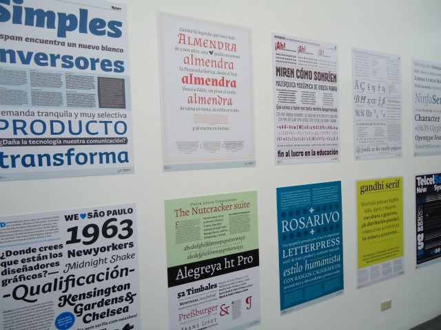
With diverse backgrounds, the three designers shared their love of letters during the forum “Anong Type Mo?” Held last November 10 at the Instituto Cervantes in Manila, the talks coincided with “Tipos Latinos,” an exhibit of the most interesting features of Latin American typographic design.
Maven of brand makeovers
“I'm actually surprised that there's an exhibit here because I've never been to one and I feel alone in this passion and not a lot of people join me in this,” said Isabel Gatuslao. 

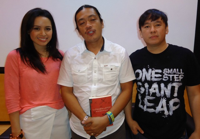
The Pinoy typography icons on Latin fonts (L-R) Isabel Gatuslao, Felix Mago, and AJ Dimarucot.
Gatuslao is the woman behind the updated corporate identities of Medicard and National Bookstore. She has a background in interior design, but felt she was better off picking typefaces and designing logos. For her, typography has always been part of daily life.
“I'm really obsessed with it. Like when I go to a restaurant and I order from the menu, that's the first thing I look at. My life is like 'Name That Font',” she said. “I feel it is a very underrated art form. If you think about it, what are we going to do without typography? Everyone's going to be in an accident.”
Gatuslao likes to know a person intimately first, before designing a logo for him. This is what she did when she worked on media personality Daphne Osena-Paez’s website, which thereafter enjoyed an increase in traffic.
“She is kind of like this girl who grew up in Canada,” Gatuslao explained. “You know how Canadians have a very French background because some parts of it speak in French there? She has very French provincial aesthetics, so what I did was I researched on that period and I used linen background because her furniture line is inspired by that look.”
Her advice to aspiring designers? “Don't work with crappy people.” If you love the people you are collaborating with, Gatuslao said, it will show on the designs.
Veteran book designer
“I really feel old,” book designer Felix Mago said repeatedly in the forum. Mago thinks his techniques are a bit old-fashioned compared to the two designers. 

The breadth of Latin American typographic design on display at the Instituto Cervantes.
Mago had no previous knowledge of the digital tools used by current graphic designers. He did not even carry a business card during the event because, he said, he gets clients by word of mouth.
The book designer showed samples of his work, showing how varying font sizes can help the book “talk to readers.” He emphasized that readability of the text is an important aspect of typography.
“My job is to make the readers pick up the book and finish reading it,” he said.
Mago added that the task of adapting Filipino sensibilities in typography now rests on the younger generation. “During our time, when I was still starting, that was the challenge to us,” he said. “Now the challenge is passed on to the younger batch of designers.”
Beyond just shirts
Shirt designer AJ Dimarucot said his work is more suitably termed “lettering” than typography.
“I initially hated typefaces so I created my own lettering,” he said. He admitted, though, that he has since begun using typefaces on his shirt and bag designs. Unlike Mago and Gatuslao, Dimarucot’s works didn’t often need to be readable. An ad agency in Singapore once commissioned him to create a design where the tagline could not be seen at first glance.
Dimarucot advised younger designers to get their works out online through sites like Behance or Deviantart, and more importantly to create artworks because you love doing it.
“Most of the time,” Dimarucot shrugged, “I get clients because I was not really thinking about getting clients.”
The designs he created for pound-for-pound boxing champion Manny Pacquiao, first borne out of his admiration and posted online, eventually caught the eye of global sports brand Nike.
“And that’s where it started. I got clients left and right,” he said. –KDM/KG, GMA News
The Latin Typography exhibit runs until December 22, 2012 at Instituto Cervantes in T.M. Kalaw St., Manila.
More Videos
Most Popular


